blog authors
past blog entries

Welcome to the Kellylab blog

geospatial matters

Please read the UC Berkeley Computer Use Policy. Only members can post comments on this blog.

Monday
Aug292016

This year's class: the why, how and what of GIS

Here are the tag clouds from this year's GIS class: the why, how and what of our upcoming semester's projects. Word clouds from Wordle.

The Why: what are the key problems class members want to focus on...

 The How: possible methods we will use...

 The What: some of the datasets that might be used...

Off to a great start!


Tuesday
Aug232016

New digitization project: Soil-Vegetation Map Collection

Between the years 1949-1979 the Pacific Southwest research station branch of the U.S. Forest service published two series of maps: 1) The Soil-Vegetation Maps, and 2) Timber Stand Vegetation Maps. These maps to our knowledge have not been digitized, and exist in paper form in university library collections, including the UC Berkeley Koshland BioScience Library.

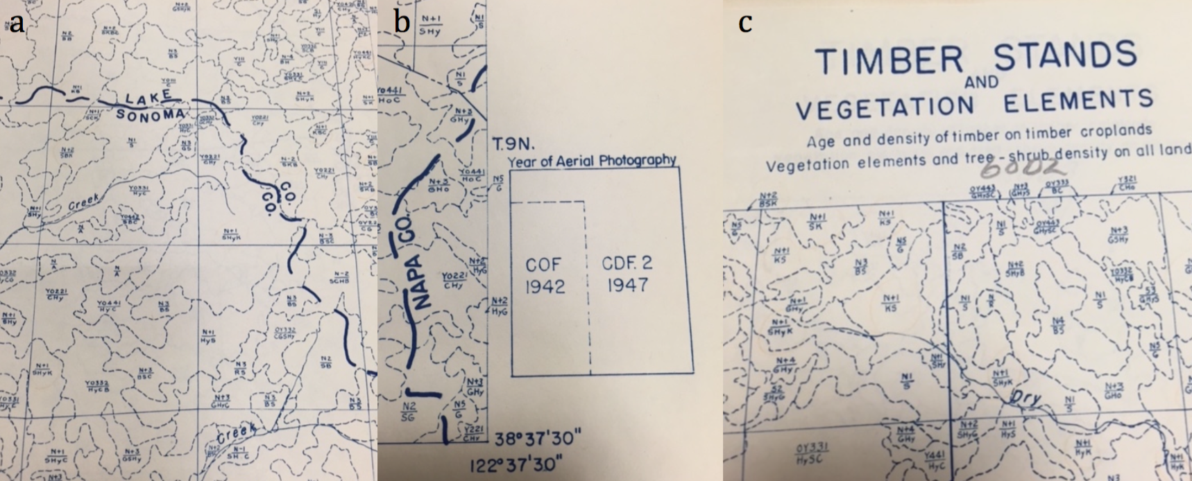
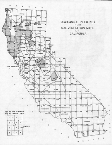
Index map for the Soil Vegetation MapsThe Soil-Vegetation Maps use blue or black symbols to show the species composition of woody vegetation, series and phases of soil types, and the site-quality class of timber. A separate legend entitled “Legends and Supplemental Information to Accompany Soil-Vegetation Maps of California” allow for the interpretation of these symbols in maps published 1963 or earlier. Maps released following 1963 are usually accompanied by a report including legends, or a set of “Tables”. These maps are published on USGS quadrangles at two scales 1:31,680 and 1:24,000. Each 1:24,000 sheet represents about 36,000 acres. 

The Timber Stand Vegetation Maps use blue or black symbols to show broad vegetation types and the density of woody vegetation, age-size, structure, and density of conifer timber stands and other information about the land and vegetation resources is captured. The accompanying “Legends and Supplemental Information to Accompany Timber Stand-Vegetation Cover Maps of California” allows for interpretation of those symbols. Unlike the Soil-Vegetation Maps a single issue of the legend is sufficient for interpretation. 

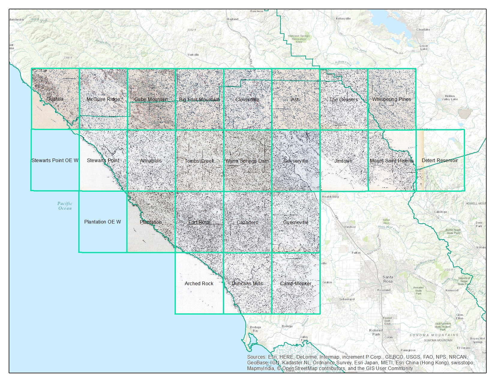
We found 22 quad sheets for Sonoma County in the Koshland BioScience Library at UC Berkeley, and embarked upon a test digitization project. 

Scanning. Using a large format scanner at UC Berkeley’s Earth Science and Map library we scanned each original quad at a standard 300dpi resolution. The staff at the Earth Science Library completes the scans and provides an online portal with which to download. 

Georeferencing. Georeferencing of the maps was done in ArcGIS Desktop using the georeferencing toolbar. For the Sonoma county quads which are at a standard 1:24,000 scale we were able to employ the use of the USGS 24k quad index file for corner reference points to manually georeference each quad. 

Error estimation. The georeferencing process of historical datasets produces error. We capture the error created through this process through the root mean squared error (RMSE). The min value from these 22 quads is 4.9, the max value is 15.6 and the mean is 9.9. This information must be captured before the image is registered. See Table 1 below for individual RMSE scores for all 22 quads. 

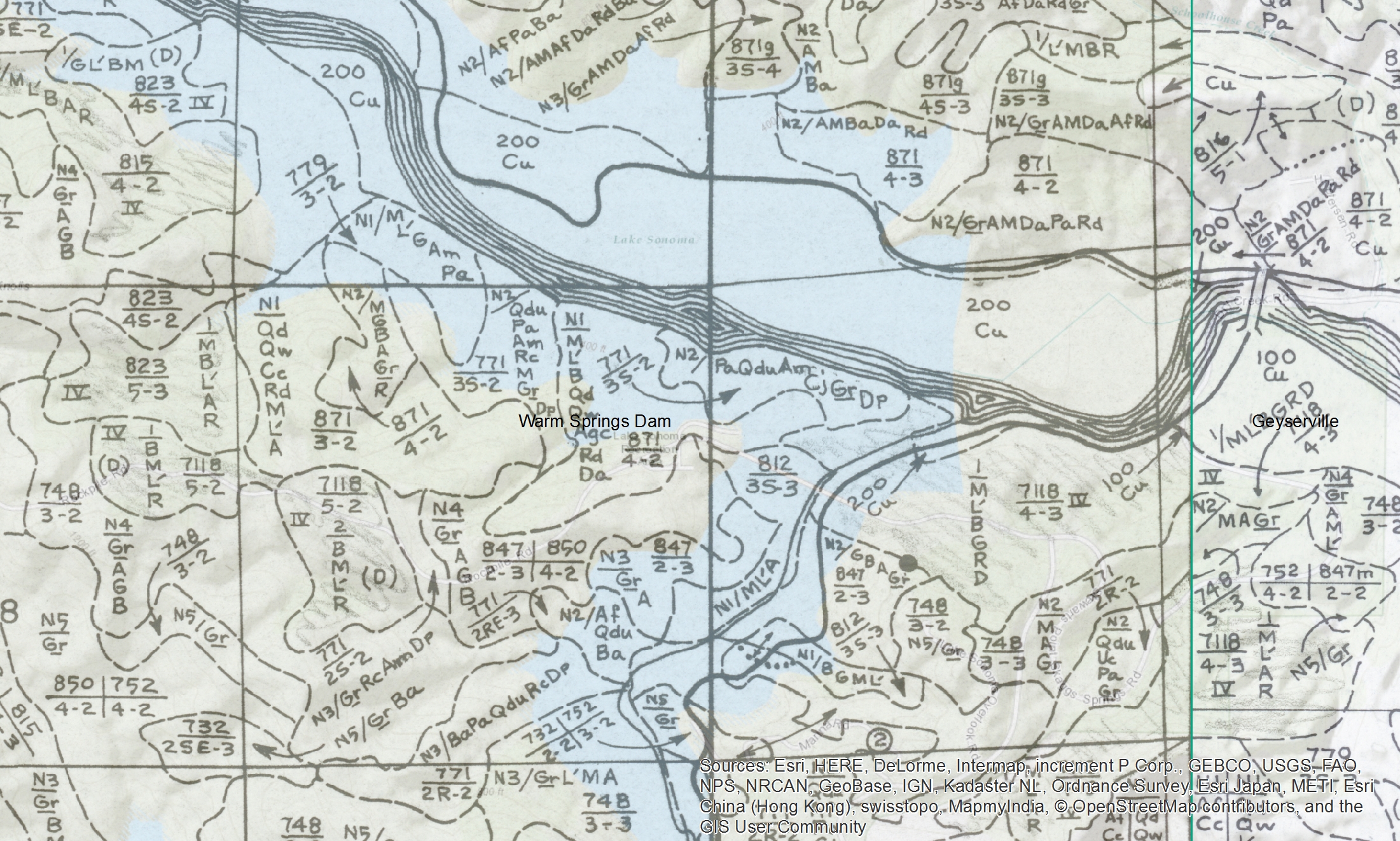
Conclusions. Super fun exercise, and we look forward to hearing about how these maps are used. Personally, I love working with old maps, and bringing them into modern data analysis. Just checking out the old and the new can show change, as in this snap from what is now Lake Sonoma, but was the Sonoma River in the 1930s.


There are also challenges. Like where do I put my tie-point for this corner?


Here is the final mosaiced product. 

Thanks Kelly and Shane for your work on this!

Monday
Aug082016

A new tool for finding old maps: USGS topoView

Get your topo maps!


The USGS recently unvieled a new, extremely easy and enviably sleek web mapping interface to search and download nearly 178,000 topographical maps, dating from 1880 to 2010.

Monday
Aug082016

ISECCI historical ecology working group wrap-up

Last week Kelly and I with others travelled to the Sierra Nevada Aquatic Research Lab (SNARL) in the eastern Sierra Nevada, just south of Mono Lake for a research retreat. SNARL is part of the UC's Natural Reserve System, which is comprised of nearly 40 properties across the state. These are preserves that foster research, education and collaboration. They have much in common with ANR's REC system. I've been to a few of them now, and am very pleased to make more visits. I love the east side of the Sierra, and that iconic Highway 395. 

This trip was a retreat for the ISECCI historical ecology working group, led by the inspirational Peter Alagona from UCSB. We discussed our existing projects, including the VTM work (see figure below), and talked about potentials for more collaborative research and further integration between NRS and ANR. We have a list of wishes for digitization, and if anyone out there has ideas about pitching these to donors, please let me know. For example: 

  • Kelly and I want to digitize the Leiburg maps from the northern Sierra to add to the VTM stack;
  • We want to find a better way to index and view historical aerial photography state-wide. Something like this for historical maps: http://ngmdb.usgs.gov/maps/TopoView/help/

And we had a field trip looking at Mono Lake water issues. Great time spent!

Density of VTM features across the collections

Wednesday
Aug032016

Digitizing old maps for science: the Soil-Vegetation Map Series

As many of you know, my lab at Berkeley has been involved in rescuing, digitizing and sharing historical ecological data for about a decade. Our big push has been working with the Wieslander Vegetation Type Mapping (VTM) project in California. The VTM collection, created in the 1920s and 1930s, has been described as “the most important and comprehensive botanical map of a large area ever undertaken anywhere on the earth’s surface” (Jepson et al. 2000). It was pioneered by Albert E Wieslander, an employee of the Forest Service Forest and Range Experiment Station in Berkeley, CA. Overall, the collection covers about 28 million ha or just over a quarter of the state including natural areas exclusive of the deserts and the larger agricultural areas. The collection includes over 200 vegetation maps, 18,000 vegetation plots, over 3,000 photographs, and over 100 plant voucher specimens.  It is a detailed, extensive (although not complete), and multi-modal description of the vegetation of California in the early 20th century, and its availability in digital form presents multiple opportunities to examine, characterize and understand changes to California landscapes. Many groups around the state have helped in the digitization, and now the four parts of the collection are reunited in digital space. Here is a nice pic of their coverage in the state. 

The data has been used in many scientific publications, but one of the VTM projects under-sung roles has been to provide a foundation for many subsequent mapping efforts in the state. For example, the protocols developed by Wieslander and his crew became the foundation for the State Cooperative Soil-Vegetation surveys from that covered 4.6 million ha of land during 1947-1977. Those early surveys paved the way for many of the contemporary vegetation classification schemes used today in California, including the Manual for California Vegetation, the National Vegetation Classification System, and the California Gap Analysis Program.

The maps from the State Cooperative Soil-Vegetation Survey of California, which are the first state-wide program to use aerial photography interpretation to produce vegetation and timber maps, have not to our knowledge been digitized, and might add to the understanding of California flora in the post-war period. We are about to embark on a pilot project to examine the feasibility of digitizing and georeferencing these soil-vegetation maps, and adding them to the digital collection. I think the georeferencing process will have to be just an attribution of the marked corner coordinates. Stay tuned! Here are some snap shots so you know what we are up against.

Map examples: a) detail of veg polygons; b) index indicating year of aerial photo used; c) example from timber series of maps Fore more about the VTM project, see my blog posts here, and the vtm.berkeley.edu website. 

Sunday
Jul312016

New datum for Australia: catch me if you can!

In the US, we have revised our geodetic datum over the yearrs. Most famously the switch from NAD27 to NAD83 as instrumention necessitated more measurements and resulted in a more accurate model. But in Australia, they are creating a new datum because the continent is MOVING 7cm a year. 

Read here: http://www.bbc.com/news/technology-36912700

Check it:

The Geocentric Datum of Australia, the country's local co-ordinate system, was last updated in 1994. Since then, Australia has moved about 1.5 metres north.

So on 1 January 2017, the country's local co-ordinates will also be shifted further north - by 1.8m.

The over-correction means Australia's local co-ordinates and the Earth's global co-ordinates will align in 2020.

Tuesday
Jun282016

I for one welcome our ESRI overloards: Wrap Up from the 2016 ESRI User Conference

What a full week! Here is my wrap-up from a great 2016 ESRI User Conference.

I haven't been here in many years, and I am glad I came. I learned much, and have some new ideas for workshops and classes, and how IGIS can be more of service to ANR, and I got started on ArcGIS Pro - ESRI's eventual replacement for ArcGIS Desktop. Pro has a completely new user interface that is very clear; you can visualize, edit, and perform analysis in both 2D and 3D; it is super fast via multithreading & 64-bit processing (finally), and it has new icons and a bunch of new processing tools. A bunch of very cool stuff comes with 1.3 soon. 

Day 1: Monday was spent in big-picture, inspirational talks from camera beautiful GIS people. 15,000 in the audience, 10 massive screens. I loved it, I felt like I was at a really intense but sedate rock concert. Note to ESRI: could you put the chairs any closer together? The highlight was speaker keynote Andrea Wulf, talking about her obsession with Alexander Von Humboldt.  Note to self: get the book. In addition to the big picture stuff, Day 1 is ESRI's chance to highlight this year's software improvements as we continue the voyage away from the desktop workflow: Pro, integrated 3D, green design, Apps, seamless integration with the web. 

Day 2: Tuesday focused on workshops. I picked four workshops from the Spatial Statistics Team at ESRI. These were led by Lauren Bennett and her crew (Flora Vale, Jenora D'Acosta). Uniformly fantastic. I had downloaded Pro the night before, and with some trepidation got started and followed along. I am happy to report that it seems very intuitive. I have read elsewhere about worries that there is loss of cartographic control, and I will look into that. I learned about the Spatial Stats toolbox in Pro, and some very new capacity in optimization of pattern analysis (you know how difficult it is to pick that distance kernel), and in the new space-time cube capabilities. The space-time capabilities make very complex analyses doable, and are very exciting, but still a bit constraining if you don't know how to update the code. Oh yeah, and space-time uses netCDF format. 

Day 3: For Wednesday's workshops I chose workshops that would help me update class labs: Python + Raster analysis; Site suitability in Pro; Cost Connectivity in Pro; and some crazy cool prediction tool called Empirical Baysien Kriging, which I will be checking out.  I guess EBK has been around for awhile, but now implemented in ESRI software. The new suite of tools in site suitability + connectivity are going to be key. Kevin M. Johnston and Elizabeth Graham led the Site Suitability and Connectivity, and Eric Krause led the Kriging workshop. 

Day 4: All day was spent in Pix4D immersion with the excellent Pix4D support/training team. Pix4D is the gold standard for drone imagery workflow; it also serves as the backend engine for ESRI's Drone2Map application, which I have not tried. Most of the morning was spent in basics: workflow basics, application domains, super wow factor examples like 0.5cm resolution imagery processing. We also looked at workflow and best practices, accuracy, and some example projects. The room was full of 50+ people, many with specific questions about a range of projects. Got to hang out a bit with Greg Crustinger, who is now at Parrot. Even more excited now about our new Sequoia cameras. 

Thoughts:

  • Little Italy has some great restaurants. 
  • We need to move to Pro soon. Probably not in time for Fall's class, but soon. GIF and IGIS workshops are going to have to get updated. 
  • I need to get more in touch with imagery analysis in Pro. Especially with the segmentation and classification part. 
  • I want to recreate the workflow for site suitability + locate regions + cost connectivity soon. 
  • The ability to perfom complex analyses in a GUI is increasingly easy, but is that a good thing? We have to be increasingly vigilant about training the fundamentals as well. 
  • One frustration about these workshops that I bet my workshop participants share - the data all is perfect, and ready to go. We need to keep talking about where to get data, and how to wrangle it into shape. 
  • Could drones mean the resurrection of photogrammetry? At least in the classroom?

Trends: 

  • Hyper granularity: how do we processes these increasingly fine resolution datasets? 
  • Global to local focus in modeling: GWR, optimized Getis-Ord, empirical baysien kriging all try to deal with and model local variability across a complex study area;
  • Incorporation of permutations and distribution functions in modeling has been made way easier;
  • Big Data, multidimensional data, temporal data: ESRI is really trying to be a better informatics platform for research;
  • ESRI seems to be increasingly relying on external and open standards for new data formats/products; this is a great trend;
  • Decision-making: all these analyses need to support decision-making; communication remains critical, tools for web-based interaction continue to expand.
Tuesday
Jun142016

Searching for patterns in high res imagery: template matching

From two friends in the space of a week! While I was away, this tool made the rounds: 

http://sf.terrapattern.com/: This is the alpha version of Terrapattern, a visual search tool for satellite imagery. The project provides journalists, citizen scientists, and other researchers with the ability to quickly scan large geographical regions for specific visual features.  

It is a great deal like some of the template matching routines in Definiens Ecognition among other proprietary software tools.  

Here is an article about it: http://techcrunch.com/2016/05/25/terrapattern-is-a-neural-net-powered-reverse-image-search-for-maps/ 

They say:

Terrapattern is a visual search engine that, from the first moment you use it, you wonder: Why didn’t Google come up with this 10 years ago? Click on a feature on the map — a baseball diamond, a marina, a roundabout — and it immediately highlights everything its algorithm thinks looks like it. It’s remarkably fast, simple to use and potentially very powerful. 

Go ahead and give it a try first to see how natural it is to search for something. How does that work? And how did a handful of digital artists and developers create it — and for under $35,000?

The secret, as with so many other interesting visual computing projects these days, is a convolutional neural network. It’s essentially an AI-like program that extracts every little detail from an image and looks for patterns at various levels of organization — similar to how our own visual system works, though the brain is infinitely more subtle and flexible.

Tuesday
Jun072016

Google vs Apple Maps: an in-depth comparision

Did you know that Apple maps labels more cities than Google maps but Google labels more roads then Apple? Fun facts galor! Find out more differences between these too maps then you ever knew you wanted to know in this great article here, and keep your eye out for part too soon to come! Happy comparing!

Tuesday
Jun072016

National Park Maps All in One Place

Kudos to Matt Holly, a member of the National Park Service’s (NPS) National Resource Stewardship and Science Directorate.  Matt has been uploading all of the NPS maps into a single portal available online.  At the moment these maps are available in GIF, JPEG, and PDF...but maybe shapefiles will follow??  You can search the maps alphabetically by park, or by state.  Access the website here.