Today I went to a great D-Lab Workshop on Demographic Mapping Tools. Berkeley's GIS and Map Librarian, Susan Powell walked us through the use of several very easy to use mapping tools available through UC Berkeley. Both are really great for quickly visualizing data from many different sources.
#1: SimplyMap: http://sm2.simplymap.com/index.html
Pros: This interface allows the easy visualization of census data (back to 1980), crime data, as well as lifestyle and market data. SimplyMap is accessible with a UC Berkeley login and can be accessed through the Berkeley Library website. It allows you to export data as shapefiles or image files, has a table-building function, and allows limited data filtering and masking. The data provided come with metadata. Most data available can be visualized down to the census tract or zipcode level. You can save and share maps from your private account.
Cons: You cannot combine variables or years of data in the map itself, but you can do this in SimplyMap's table building function and export that. The user interface is not always simple or straightforward.

Above: Dollar amount spent at restaurants in Berkeley in 2014 by census tract. Map created using SimplyMaps.
#2 PolicyMap: http://ucberkeley.policymap.com/maps
Pros: PolicyMap includes census data (back to 2000), housing, health, government programs, crime, and education data. Like SimplyMap this allows the quick and easy visualization of data in a single year. PolicyMap also allows you to upload and overlay your own data with its existing datasets and generally allows for a bit more overlaying of datasets--point data can be added on top of polygons. You can generate quick pre-defined reports on specific cities or areas. You can also define a custom study area in PolicyMap. It has a table-builder as well as a really great data-dictionary that explains where its data come from.
Cons: There are no private accounts. All of Berkeley has a single account, so you can see everyone else's data, and they can see yours. Thus, you must log-in through UC Berkeley's website to gain access. This datasharing may not be an absolute con, but it is a little weird. PolicyMap does not allow you to export shapefiles, but it does allow you to build tables that can be easily joined with shapefiles if need be. It too has some user-interface quirks that could probably be improved upon.
 Alice
Alice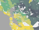
 Kelly Lab SPUR Students Drew Adamski and Ryan Avery have been participating in lab research all semester. In particular they have been helping classify trails within the Pacific West's National Parks. This month we were lucky enough to travel out with them to Point Reyes National Seashore to see some of those trails in person. We were also lucky enough to spend the day with Chief Ranger Schifsky who was kind enough to talk to us about what issues different trails in the park were facing and which trails seemed to be changing most rapidly. Chief Schifsky was also kind enough to show us some of the points in the park where the landscape had changed dramatically over time due to fire, restoration projects, or differing management strategies. Overall it was a really inspiring and informative trip!

