blog authors
past blog entries

Welcome to the Kellylab blog

geospatial matters

Please read the UC Berkeley Computer Use Policy. Only members can post comments on this blog.

Entries in webgis (129)

Tuesday
Oct022012

CartoDB launches tools for visualizing temporal data

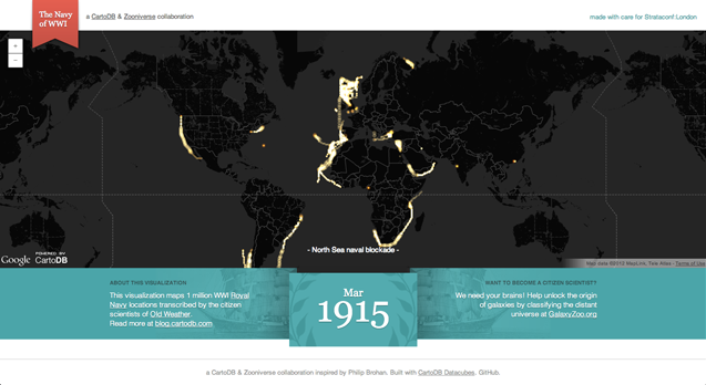
CartoDB, a robust and easy to use web mapping application, today launched "torque" a new feature enabling visualization of temporal data sets. 

From the CartoDB team:

Torque is a library for CartoDB that allows you to create beautiful visualizations with temporal datasets by bundling HTML5 browser rendering technologies with an efficient data transfer format using the CartoDB API. You can see an example of Torque in action on the Guardian's Data Blog, and grab the open source code from here.

Be sure to check out the example based on location data recorded from Captain's logs from the British Royal Navy during the first World War.  Amazing stuff!


Wednesday
Sep262012

New green blog about our web participation paper

Check it out! our recent paper on the SNAMP website is featured in the green blog.

Friday
Aug312012

Bing Maps completes Global Ortho project for US

The Bing Maps team has anounced the completion of the Global Ortho Project for the US.  The project provides 30cm resolution imagery for the entire US, all acquired within the last 2 years.  You can access all of the imagery now through Bing Maps, it is pretty amazing to see such detail for all of the far off places that typically don't get high resolution attention. 

Find out more about the project from the Bing Maps Blog, or view the data for yourself.

Friday
Aug242012

Fire Forecast

NPR recently created a neat interactive web map depicting locations of large active wildfires (updated every 30 min) and current wildfire danger forecasts (Low to Extreme) for areas in the lower 48 states (updated daily). Check out the map here and the accompany news story here. Map was created by Matt Stiles, Stephanie D'Otreppe and Brian Boyer.

Screenshot of NPR's Fire Forecast map

Monday
Jul232012

New open datasets for City of Oakland and Alameda County

Following on the footsteps of the county and city of San Francisco open data repository at data.sfgov.org, two new beta open data repositories have recently been released for the City of Oakland and Alameda County. This development coincides with the recent 2012 Code for Oakland hackathon last week. The hackathon aims to make government more transparent in the city and county through the use of technology with apps and the web to make public access to government data easier. The City of Oakland’s open data repository at data.openoakland.org includes data on crime reports for a variety of spatial scales, a variety of tabular and geographic data such as parcels, roads, trees, public infrastructure, and locations of new development to name a few. It is important to note that the Oakland open data repository is currently not officially run or maintained by the City of Oakland. It is currently maintained by members of the community and the OpenOakland Brigade. Alameda County’s open data repository at data.acgov.org includes data on Sherriff crime reports, restaurant health reports, solar generation data, and a variety of tabular and geographic data and public health department data. Data can be viewed on a browser as an interactive table or an interactive map or the data can be downloaded in a variety of formats. Both sites are still in their infancy so expect more datasets to come online soon. Also on the same note, the Urban Strategies Council recently released a new version of their InfoAlamedaCounty webGIS data visualization and map viewer - check it out.

 Screenshot of City of Oakland Open Data: data.openoakland.org

Screenshot of Alameda County Open Data: data.acgov.org

Friday
Jul202012

Crowdsourced neighborhood boundaries

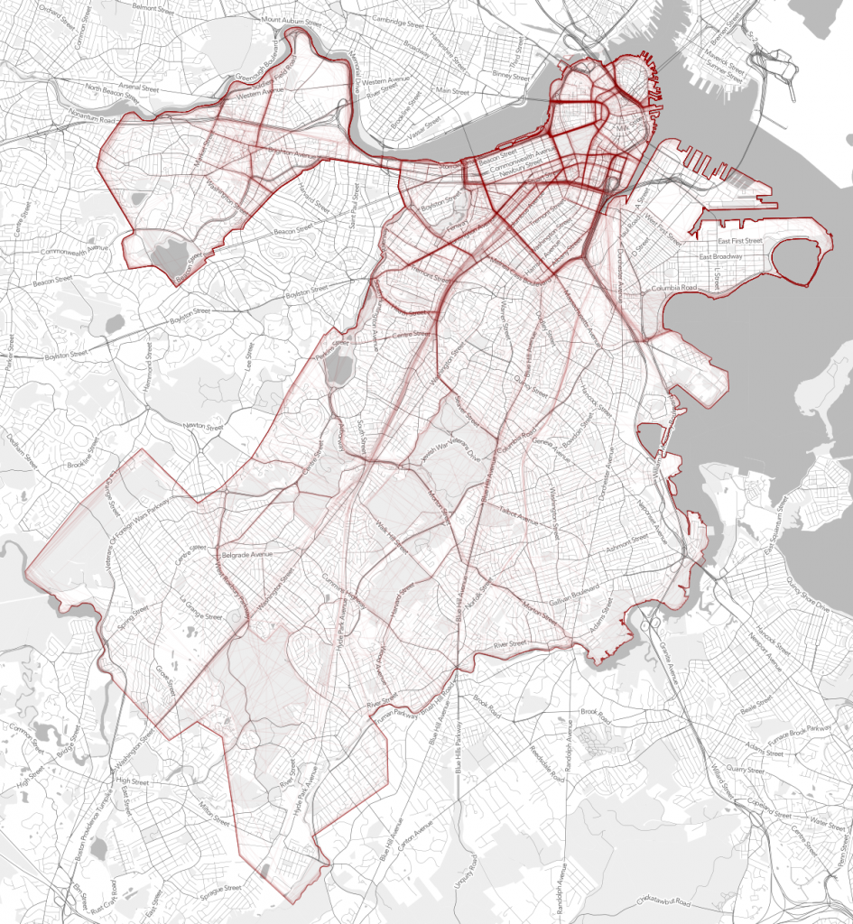
Andy Woodruff and Tim Wallace from Bostonography discuss the first preliminary results of an experiment they set up with an interactive webGIS tool that allows people to draw polygons where they think each of Boston’s neighborhoods are located. About 300 maps of neighborhoods have been submitted so far and with the compiled data there are many areas of agreement and disagreement on where neighborhood boundaries may lay. Bostonography created maps showing a gradient of agreement for each neighborhood's boundary. This exercise is reminiscent to the work of Kevin Lynch and is an interesting experiment in trying to see if there is a consensus on where people think neighborhood boundaries are as opposed to how they are defined officially by the city. For the full blog post and maps on Bostonography click here. For an article in the Atlantic Cities that discusses the maps click here.

Strength or density of polygon line placement of crowdsourced neighborhood boundaries

Monday
Jul022012

New Trulia commute time maps

Trulia recently released a new commute time map that shows your estimated time of arrival in real time to all points in a region. The service uses OpenStreetMap data and General Transit Feed Specification (GTFS) feeds to calculate travel time. Drive times are available nationwide with public transit travel time only available in select cities for now. Read the full story here or click here for the map.

Screenshot from Trulia commute map

Thursday
Apr262012

Livehoods: Dynamic maps of place via social networking

Livehoods is an interesting research project from the School of Computer Science at Carnegie Mellon University which maps social networking activity and patterns using tweets and check-ins to examine the hidden structure of cities and neighborhoods. For example below on the map each point represents a check-in location. Groups of nearby points of the same color represent a Livehood. Within a Livehood statistics are calculated aggregating check-ins overtime and depicts how a place is used. For more information on Livehoods click here.

Livehoods Screenshot

Wednesday
Mar282012

Old SF Interactive GeoPhoto Map

Check out Old SF, an interactive map of about 13,000 geocoded historical images of the city from The San Francisco Public Library's Historical Photograph Collection. Created by Dan Vanderkam and Raven Keller, the site includes photos as far back as 1850, whick you can select for via a sliding scale. 

Saturday
Mar242012

ASPRS 2012 Wrap-up

ASPRS 2012, held in Sacramento California, had about 1,100 participants. I am back to being bullish about our organization, as I now recognize that ASPRS is the only place in geospatial sciences where members of government, industry, and academia can meet, discuss, and network in a meaningful way. I saw a number of great talks, met with some energetic and informative industry reps, and got to catch up with old friends. Some highlights: Wednesday's Keynote speaker was David Thau from Google Earth Engine whose talk "Terapixels for Everyone" was designed to showcase the ways in which the public's awareness of imagery, and their ability to interact with geospatial data, are increasing. He calls this phenomena (and GEE plays a big role here): "geo-literacy for all", and discussed new technologies for data/imagery acquisition, processing, and dissemination to a broad public(s) that can include policy makers, land managers, and scientists. USGS's Ken Hudnut was Thursday's Keynote, and he had a sobering message about California earthquakes, and the need (and use) of geospatial intelligence in disaster preparedness.

Berkeley was well represented: Kevin and Brian from the GIF gave a great workshop on open source web, Kevin presented new developments in cal-adapt, Lisa and Iryna presented chapters from their respective dissertations, both relating to wetlands, and our SNAMP lidar session with Sam, Marek, and Feng (with Wenkai and Jacob from UCMerced) was just great!

So, what is in the future for remote sensing/geospatial analysis as told at ASPRS 2012? Here are some highlights:

  • Cloud computing, massive datasets, data/imagery fusion are everywhere, but principles in basic photogrammetry should still comes into play;
  • We saw neat examples of scientific visualization, including smooth rendering across scales, fast transformations, and immersive web;
  • Evolving, scaleable algorithms for regional or global classification and/or change detection; for real-time results rendering with interactive (on-the-fly) algorithm parameter adjustment; and often involving open source, machine learning;
  • Geospatial data and analysis are heavily, but inconsistently, deployed throughout the US for disaster response;
  • Landsat 8 goes up in January (party anyone?) and USGS/NASA are looking for other novel parterships to extend the Landsat lifespan beyond that;
  • Lidar is still big: with new deployable and cheaper sensors like FLASH lidar on the one hand, and increasing point density on the other;
  • Obia, obia, obia! We organized a nice series of obia talks, and saw some great presentations on accuracy, lidar+optical fusion, object movements; but thorny issues about segmentation accuracy and object ontology remain; 
  • Public interaction with imagery and data are critical. The Public can be a broader scientific community, or a an informed and engaged community who can presumably use these types of data to support public policy engagement, disaster preparedness and response.