blog authors
past blog entries

Welcome to the Kellylab blog

geospatial matters

Please read the UC Berkeley Computer Use Policy. Only members can post comments on this blog.

Friday
Jul202012

Crowdsourced neighborhood boundaries

Andy Woodruff and Tim Wallace from Bostonography discuss the first preliminary results of an experiment they set up with an interactive webGIS tool that allows people to draw polygons where they think each of Boston’s neighborhoods are located. About 300 maps of neighborhoods have been submitted so far and with the compiled data there are many areas of agreement and disagreement on where neighborhood boundaries may lay. Bostonography created maps showing a gradient of agreement for each neighborhood's boundary. This exercise is reminiscent to the work of Kevin Lynch and is an interesting experiment in trying to see if there is a consensus on where people think neighborhood boundaries are as opposed to how they are defined officially by the city. For the full blog post and maps on Bostonography click here. For an article in the Atlantic Cities that discusses the maps click here.
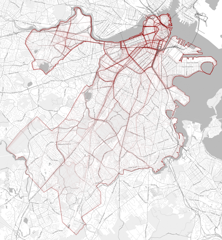
Strength or density of polygon line placement of crowdsourced neighborhood boundaries

Monday
Jul022012

New Trulia commute time maps

Trulia recently released a new commute time map that shows your estimated time of arrival in real time to all points in a region. The service uses OpenStreetMap data and General Transit Feed Specification (GTFS) feeds to calculate travel time. Drive times are available nationwide with public transit travel time only available in select cities for now. Read the full story here or click here for the map.

Screenshot from Trulia commute map

Friday
Jun222012

Modern Map Making Film Circa 1940

Here is a funny yet informative film called “Caught Mapping” produced by Chevrolet in 1940 depicting how road maps were made at the time. The film was released by the Prelinger Archive and depicts the entire process of map making from field surveying to map updating.

Click here for the video and for the story in The Atlantic or view below.


Friday
Jun222012

New ArcGIS and QGIS desktop versions available

Big updates are now available to both ArcGIS and QGIS bringing more power and functionality to desktop GIS users!

ArcGIS 10.1 is now available with lots of new features.  Learn more from ESRI.com.  The GIF is now testing the updated software and we plan to make it available on lab workstations in the coming weeks.

QGIS 1.8 is also now available, and is free for download.  Visit QGIS.org for download instructions and to learn more about the new features available in this release.

Thursday
Jun212012

What is "success" with post-disaster crowdsourcing?

At a recent workshop I gave on webGIS, after giving an overview of some of the recent uses of crowdsourced and VGI in disasters (fire in San Diego, earthquake in Christchurch, Ushahidi everywhere...), I was asked about success of these projects. Who used the data? How? (and who funded these websites, but that is another story.) And I had only the vaguest of answers. Here is a thoughful critique on this subject by Paul Currion on MobileActive.org. He examines the use of the Ushahidi project in Haiti. Paul is an aid worker who has been working on the use of ICTs in large-scale emergencies for the last 10 years.  He asks whether crowdsourcing adds significant value to responding to humanitarian emergencies, arguing that merely increasing the quantity of information in the wake of a large-scale emergency may be counterproductive. Why? because aid workers need clear answers, not a fire-hose of information. Information from the crowd needs to be curated, organized, targeted for response. He makes the point that since crowdsourced data is going have to be sorted through, and can be biased, and can be temporary, aid agencies are going to have to carry out exactly the same needs assessments that they would done without the crowdsourced information.

Where and when do crowdsourced data add value to a situation or project? How can we effectively deal with the bias in the data that comes naturally? We deal with this all the time in my smaller web-related projects: oakmapper and snamp for example. What is the future role of the web for adaptive forest management for example? How do these new collaborative and extensive tools help us make important decisions about natural resources management in often contentious contexts? More to think about.

Wednesday
Jun202012

Void-Free Global DSM

NextMap's World 30 DSM is ready. Pricing starts at as low as 1 cent per km2.

ASTER, with some problematic gaps...

NEXTMap, without the gaps

Wednesday
Jun132012

SNAMP lidar team featured in ANR's Green Blog

The SNAMP spatial team and the cool lidar work we are doing was recently featured in ANR's Green Blog. The article highlights the work of UC Merced in forest visualization. Currently, most visualization software packages focus on one forest stand at a time (hundreds of acres), but now we can visualize an entire forest, from ridge top to ridge top. The Sierra Nevada Adaptive Management Project (SNAMP) Spatial Team principle investigators Qinghua Guo and Maggi Kelly, and graduate student Jacob Flanagan and undergraduate research assistant Lawrence Lam have created cutting-edge software that allows us to visualize the entire firescape (thousands of acres).

Wednesday
Jun132012

New software to extract geographically representative images from Google Street View

New software developed by Carnegie Mellon University in Pittsburgh and INRIA in Paris mines the geotagged imagery in Google Street View to uncover what architectural features distinguish one city from another across the globe. The software is based upon a discriminative clustering algorithm to distinguish features in one picture from another. This research shows that geographically representative image elements can be discovered automatically from Google Street View imagery in a discriminative manner.

Jacob Aron from the New Scientist reports:

"The researchers selected 12 cities from across the globe and analysed 10,000 Google Street View images from each. Their algorithm searches for visual features that appear often in one location but infrequently elsewhere...It turns out that ornate windows and balconies, along with unique blue-and-green street signs, characterise Paris, while columned doorways, Victorian windows and cast-iron railings mark London out from the rest. In the US, long staircases and bay windows mean San Francisco, and gas-powered street lamps are scattered throughout Boston."

"The discovered visual elements can also support a variety of computational geography tasks, such as mapping architectural correspondences and influences within and across cities, finding representative elements at different geo-spatial scales, and geographically-informed image retrieval."

Read the full story by clicking here.

To read the research paper and view the project website click here.

Tuesday
Jun122012

Philadelphia food desert eradication project

Here is a recent article from the Washington Post examining Philadelphia's Get Healthy Philly initiative. $900,000 from the project is going to be spent on turning 632 corner stores in the city into green grocers. The effort helps these corner stores buy and supply fresh fruits and vegetables and buy the infrastructure needed to store them, such as refrigerators.

This effort goes in hand with a new study in the city that will examine what happens when more nutritious foods are introduced into traditionally underserved neighborhoods. Measuring what people bought before, what they’re eating now, and how health outcomes change. The article also explores other research on food deserts, access to healthy foods, and health outcomes with lessons learned.

For the full article click here.

Monday
Jun112012

Tim De Chant explains why you should be excited about vector-based maps in iOS 6

Former kellylabber Tim De Chant has a nice piece on the upcoming apple mapping software for mobile devices:

Apple announced today that it’s revamping the Maps application on iOS devices—iPhone, iPad, iPod touch—introducing a lot of showy new features like turn-by-turn directions and 3D flyovers. While those make for sexy commercials, they won’t be as impactful as the switch from raster- to vector-based map data. If you’re not sure why you should be excited about the change—and you should be—read on.

Check out his blog post here.


Jonathan Crowe (formerly of The Map Room, now of "My Correct Views on Everything") has a comprehensive post on the subject here.